
How to Enhance Readability with Line Height and Letter Spacing
Introduction
Effective design heavily relies on readability, particularly in digital environments. Two important typographic factors that directly affect text readability are line height (also known as leading) and letter spacing (or tracking). Utilizing these elements correctly can greatly improve user experience, minimize eye strain, and maintain the engagement of visitors on your website or design project.
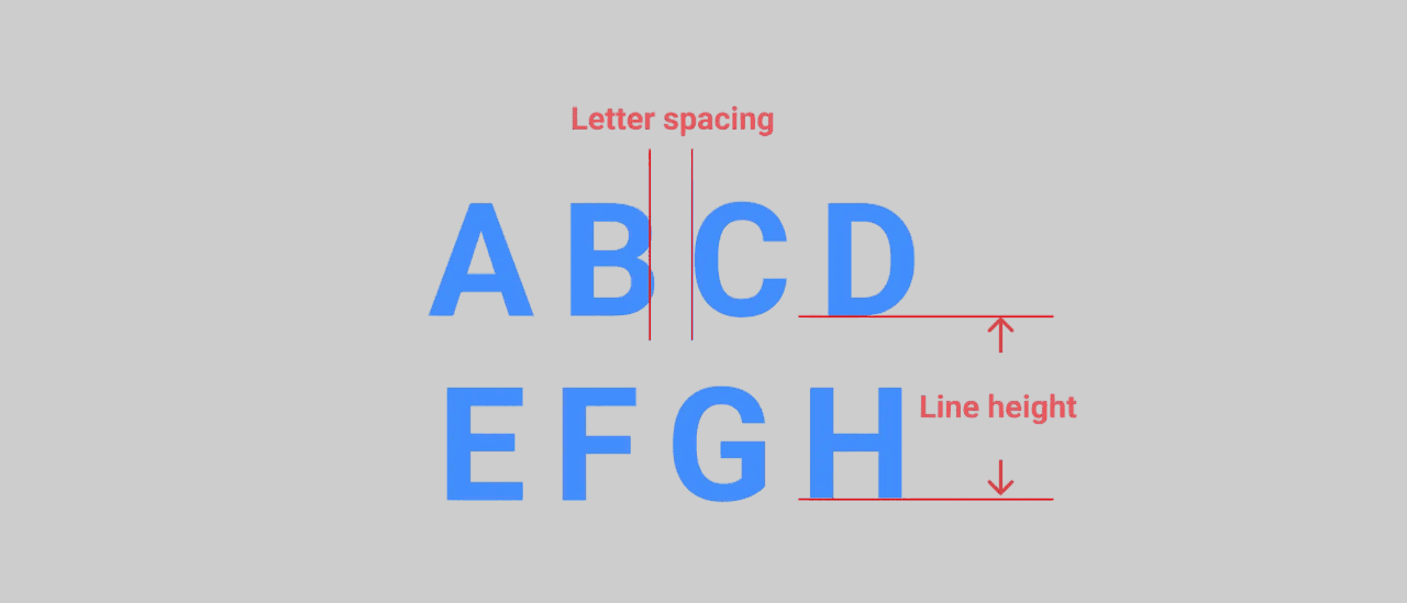
What Is Line Height?
Line height denotes the vertical spacing between lines of text. It determines the distance from the baseline of one line to the baseline of the next line. When the line height is insufficient, the text seems cramped and hard to read. If there is excessive space, the text may come across as disjointed or uneven. The ideal line height establishes a pleasant reading flow and enhances overall clarity.
What Is Letter Spacing?
Letter spacing modifies the horizontal distance between individual letters within a word or phrase. Increasing letter spacing can create a more open and readable appearance, particularly at smaller font sizes. On the other hand, decreasing letter spacing may make the text feel compact, but doing so excessively could compromise readability.
Why Are Line Height and Letter Spacing Important for Readability?
These two characteristics work together to balance text density, helping to alleviate reader fatigue. Appropriate line height allows users to move from one line to the next without losing their position. Proper letter spacing prevents characters from merging or appearing too far apart, which is particularly vital for individuals with visual impairments or when viewed on smaller screens.

Paragraph with optimized line height and letter spacing for easy reading
Best Practices for Setting Line Height and Letter Spacing
Line Height: A widely accepted guideline is to set line height at about 1.4 to 1.6 times the font size for body text. Headings may utilize tighter line heights but should still ensure clarity.
Letter Spacing: For body text, the default letter spacing is generally sufficient, but minor adjustments (0.5px to 1px) can enhance readability for small fonts or all-caps titles. It is advisable to avoid negative letter spacing in body text, as it diminishes legibility.
Responsive Adjustments: Alter line height and letter spacing depending on screen size to sustain readability across various devices. For smaller screens, increasing both line height and letter spacing might be beneficial.
Tools and Techniques to Test Readability
Designers can utilize browser developer tools, typography plugins, or design applications such as Figma and Adobe XD to experiment with line height and letter spacing. Gathering feedback from real users or employing accessibility tools can also shed light on how typography decisions impact readability.
Conclusion
Refining line height and letter spacing is a straightforward yet effective method to enhance the readability of your website or design project. Striking a balance in these settings ensures your content remains accessible, engaging, and easy to read—a crucial factor in keeping users focused and lowering bounce rates. Whether you’re creating a blog, app, or marketing material, focusing on these elements boosts the overall user experience.
More in Graphic Design


